Henry Evans died #onthisday in 1905. He collected 5,000 items of Victorian ephemera now known as the Evanion collection. Here are some highlights http://bit.ly/1HRWyP4
Image: Seed catalogue by Webb and Sons, the Queen's Seedsmen, 1885.
Evanion Collection of ephemera
Over 2,000 adverts and posters from Victorian daily life, collected by the stage magician and ventriloquist, Henry Evans - Evanion to his audience.

Helen Peden
Curator, British Collections 1801-1914
The British Library now owns some 5,000 items from the 'Evanion' collection, originally purchased by the British Museum in 1895. They include many colourful posters and handbills produced as publicity for the various entertainments staged in music halls and theatres, as well as for exhibitions, circuses and other popular events. Trade catalogues, price lists and advertising materials that were once in general circulation reflect both the necessities and the aspirations of contemporary life.
Curator's choice
Helen Peden highlights personal favourite items from the collection
Ticket for a "Wonderful and Amusing Entertainment" by M. Evanion
Henry Evans (ca.1832-1905) was born in Kennington, South London. Under the stage name "Evanion" h...
Trade card of James Pain, pyrotechnist 4228
Charles Brock's spectacular firework fetes at the Crystal Palace during the 1860s and 70s inspire...
Advertisement for cocoa products manufactured by J S Fry & Sons
Dr Joseph Fry, a Quaker apothecary with remarkable business acumen, took advantage of the opportu...
Advertisement for Edward Grove, fashionable tailor and complete outfitter
At the beginning of the 19th century, all fashionable clothing for the upper classes was made by ...
Programme for the Canterbury Theatre of Varieties, Monday 25 March 1889
The popular Canterbury Theatre of Varieties was the first of the great music halls. Opened in 185...
******
從Image and Code by E. H. Gombrich 一文的例子 我知道有
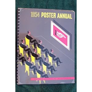
International Poster Annual 至晚1951年起
The 1950 International Poster Annual, published in Switzerland,
 |
| |
Japanese Posters: The First 100 Years
From Wikipedia, the free encyclopedia
The Festival of Britain emblem - the Festival Star - designed by Abram Games, from the cover of the South Bank Exhibition Guide, 1951
Contents |
Early years
Born Abraham Games in Whitechapel, London on July 29th, the day after World War I began in 1914, he was the son of Joseph Games, a Latvian photographer, and Sarah, a seamstress born on the border of Russia and Poland. His father anglicized the family name to Games when Abram was 12.[1] Games left Hackney Downs School at the age of 16 and went to London's St. Martins School of Art (today the Central Saint Martins College of Art and Design). Disillusioned by the teaching at St Martins and worried about the expense of studying there, Games left after two terms. However, while working as a "studio boy" in commercial design firm Askew-Young in London 1932-36, he was attending night classes in life drawing. He was fired from this position due to his jumping over four chairs as a prank.[1] In 1934, his entry was second in the Health Council Competition and, in 1935, won a poster competition for the London City Council. 1936-40, he was on his own as a freelance poster artist.Career
1946, he resumed his freelance practice and worked for clients such Shell, Financial Times, Guinness, British Airways, London Transport, El Al, and the United Nations. He designed stamps for Britain, Ireland, Israel, Jersey, and Portugal.[2] Also, he designed the logo for JFS situated currently in north-west London. There were also book jackets for Penguin Books and logos for the 1951 Festival of Britain (winning the 1948 competition) and the 1965 Queen's Award to Industry. Evidence of his pioneering contributions is the first (1953) moving on-screen symbol of BBC Television. He also produced murals.
1946-53, Games was a visiting lecturer in graphic design at London's Royal College of Art; 1958, was awarded the Order of the British Empire (OBE) for services to graphic design; 1959, was appointed a Royal Designer for Industry (RDI).[2] In the 1950s and of Jewish heritage, he was known to have spent some time in Israel where, among other activities, he designed stamps for the Israeli Post Office and taught a course in postage-stamp design.
-
Poster by Games advertising tourism for the island of Jersey.
-
British European Airways advertising poster by Games.
-
London Underground art, Swan by Games at Stockwell Station, referencing the name of a nearby pub.
In arriving at a poster design, Games would render up to 30 small preliminary sketches and then combine two or three into the final one. In the developmental process, he would work small because, he asserted, if poster designs “don't work an inch high, they will never work.” He would also call on a large number of photographic images as source material. Purportedly, if a client rejected a proposed design (which seldom occurred), Games would resign and suggest that the client commission someone else.
Exhibition
- Abram Games, Graphic Designer (1914–1996): Maximum Meaning, Minimum Means, Design Museum, London, 2003
References
- ^ a b Abram Games, Design museum. Retrieved on 5 August 2009.
- ^ a b c Souter, Nick and Tessa (2012). The Illustration Handbook: A Guide to the World's Greatest Illustrators. Oceana. pp. 203. ISBN 978-1-84573-473-2.
Further reading
- Amstutz, W.Who's Who in Graphic Art (1962. Zurich: Graphis Press)
- Gombrich, E.H., et al. A. Games: Sixty Years of Design (1990. South Glamorgan, UK: Institute of Higher Education) | ISBN 0-9515777-0-0
- Livingston, Alan and Isabella The Thames and Hudson Dictionary of Graphic Design and Designers (2003. London: Thames and Hudson) | ISBN 0-500-20353-9
- Moriarty, Catherine, et al. Abram Games, Graphic Designer: Maximum Meaning, Minimum Means [exhibition catalogue] (2003. London: Lund Humphries) | ISBN 0-85331-881-6
- Games, Naomi, et al. Abram Games: His Life and Work (2003. New York Princeton Architectural Press) | ISBN 1-56898-364-6
- Naomi Games, Poster Journeys: Abram Games and London Transport (Capital Transport, Mendlesham, UK)
External links
| Wikimedia Commons has media related to: Abram Games |
這本書我可能有2本 不同版
現在手頭有的是第三手的1972年版
有些"引路的說帖" (漢文)
| ||
|
| ||
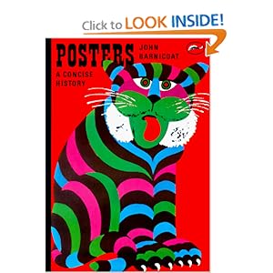
This compelling art book contains beautiful images, illuminating details, and thumbnail sketches of modern art movements. The section titled "Posters and Reality" includes vivid posters and explores the ideas of expressionism, realism, and surrealism in an accessible, yet scholarly manner.
"Posters and Society", however, remains my favorite section. Tracing the evolution of the poster through travel, theater, and liquor ads, Barnicoat explains the significance of outdoor advertising in modern cities. Posters also seem to lend themselves to an ironic, comic style.
Yet the classic posters from World War I and II show that governments can also develop ideas in the popular medium. Wartime posters played a critical role in recruitment of soldiers, selling War Bonds, and instructing civilian populations to conserve precious supplies.
Barnicoat also seems fascinated with the use of posters by communist (Soviet Union, Mao's China, Castro's Cuba) and fascist dictatorships (Nazi)to create "consensus" and the illusion of mass support. He juxaposes these propagnda efforts with the students' posters of May '68 saying "these were attempts to produce a genuine pattern of popular art." (While few propaganda posters have become popular collectibles, wartime posters and protest posters from the 1960s command good prices these days among vintage poster collectors.)
Written in 1973 in a belated celebration of the poster's 100th birthday, this classic art book does show its age - both in the evident leftist sympathies and ignoring recent trends. Posters: A Concise History, however, remains the best introduction for art lovers, graphic designers, and poster collectors.
*****
One hundred years since the 'Golden Age' of posters began
September 16, 2014 -- Updated 1609 GMT (0009 HKT)
STORY HIGHLIGHTS
- Letterpress artist Alan Kitching and Monotype have joined forces to commemorate five poster design greats with a series of prints
- Tom Eckersley, Abram Games, FHK Henrion, Josef Müller-Brockmann and Paul Rand were the leading poster artists of the last century
- Their designs were widely revered by the public and the graphic design community
(CNN) -- 1914 was a good year for poster design.
You'd be forgiven for not knowing it was then that five of the world's top poster designers were born: Tom Eckersley, Abram Games, FHK Henrion, Josef Müller-Brockmann and Paul Rand.
Though they were from different backgrounds and worked separately, the five are largely responsible for bringing modernist design and typeface sensibilities to the world of poster design from the 1940s on.
"It was a sort of Golden Age of the poster," says legendary letterpress designer Alan Kitching.
Letterpress designer and Monotype collaborator Alan Kitching.
While their names have all but slipped from public memory, a new project from Kitching and Monotype, one of the world's leading typeface design companies, is shining a new light on their revolutionary poster work, 100 years after their birth.
The results: a series of posters fusing each designer's style with Kitching's, and "Alan Kitching and Monotype: Celebrating the centenary of five pioneers of the poster," an exhibition at the London College of Communication for the London Design Festival, that will showcase Kitching's work alongside posters from each designers' estate.
The artist at work
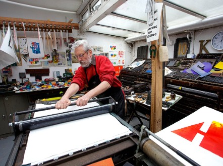
I meet Kitching at his workshop near the London College of Communication. The smell of ink and metal hits you at the door, growing stronger as you move closer to the intimidating printing press in the back. Prints of his work—eye-popping text images in rainbow hues—hang from the walls, the ceiling, a drying line. The hundreds of typeface alphabets he's made and amassed over the years (the largest collection in Europe), from indecipherably small metal nubs to wooden letters the size of a man's forearm, are filed away in stacked tiers, and leaned against walls. His only computer is a first-generation MacBook he uses to check emails.
Over the last 50 years, Kitching has built a reputation as one of the world's most acclaimed letterpress designers. And like the designers he's commemorating, he's inspired by the beauty of type.
Alan Kitching at work on his Monotype prints in his London workshop.
COURTESY PHIL SAYER
"The printed word is still powerful," he says. "I wanted to take letterpress technology and move it somewhere else from when it used to be useful."
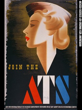
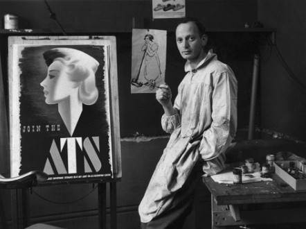
This dedication to type as art is evident in the prints he created for the collaboration. The colorful posters meld Kitching's penchant for monograms ("I like that idea of monograms: two letters interacting to make a third image,") with each designer's spirit. Their influences resonate like a baseline: Games' initials feature the bold font made famous by his posters for the Auxiliary Territorial Service (the women's branch of the British army) during World War II; Rand's feature the colorful simplicity that he would later bring to children's books.
Posters, now and then
Kitching is quick to distinguish his posters from those being commemorated. While he has done functional posters, most of his have been designed as prints, strictly things of beauty. But earlier in the 20th-century, when the designers were first breaking ground in graphic design, posters were society's primary form of communication.
"There were no other means of getting your message out there then. It was just posters," he says.
In a time before the ubiquity of photography (let alone Photoshop), good design was paramount. It was all about the "interpretation of an idea in a graphic way."
They were masters of condensing down a problem to a single cool item with bang.
Alan Kitching
Alan Kitching
For these artists, this interpretation was realized through geometric shapes, meaningful text and inventive use of color. The diversity of their work proved these principles could be applied for almost any cause, from Eckersley's simple-but-effective posters for the Royal Society for the Prevention of Accidents, to Rand and Henrion's branding work for IBM and KLM respectively; from Games'provocative war propaganda to Müller-Brockmann's geometric orchestra adverts.
"There's nothing between the message and the image. At a glance, you've got it. You didn't need a lot of words. The image is the message," Kitching says. "That's what they were masters of: condensing down a problem to a single cool item with bang."
Abram Games in his studio with his controversial ATS poster, circa 1940.
HULTON ARCHIVE/GETTY IMAGES
The public generally responded positively (Games' Guinness posters were universal favorites), but each designer received their share of push-back. One of Games' ATS recruitment posters was recalled after only a few weeks because authorities thought the glamorous woman shown sent the wrong message about the war effort, and another depicting a young boy in poverty was banned by Winston Churchill himself for being too negative.
The others' posters were derided for being too strange, too modern, and too ugly.
"A lot of people didn't recognize the things they did," Kitching explains. "They thought they were too advanced, too modern because they were working ahead of their time, really."
Even now, people look back at them and say, 'That was a great time to be doing posters.
Alan Kitching
Alan Kitching
Yet somehow their legacy survives.
The end of an era
Much has changed since Eckersley, Games, Henrion, Müller-Brockmann, and Rand elevated the poster to high art. Changing technology has rendered their methods obsolete, and posters have had to become more brash and stylized to keep the public's attention.
"A lot of things today have very fleeting life. It's ephemeral. It comes out quickly and it certainly doesn't last that long," Kitching says.
But the appeal of these modernist designs, now decades old, remains. Posters that were quite common during their time now sell for exorbitant prices at auction. And to Kitching and other designers, they are a vestige of another time when a handful of great designers ruled supreme.
"They were regarded as the high professional designers of the world," Kitching says. "Even now, people look back at them and say, 'That was a great time to be doing posters.'"
Alan Kitching will be speaking about the designers at Five Lives in Posters: A Panel Discussion at the London College of Communication on September 18, 2014.



沒有留言:
張貼留言